The Google Sheets chart function can be a helpful tool when you have a lot of data that you want to visualize. It will help to transform the data into a more digestible format, like a simple bar graph, helping you get the sense out of it that would otherwise prove challenging.
Here’s how to quickly and easily add a graph to your Google Sheet spreadsheet.
How to Make a Bar Graph
In Google Sheets, you can create a bar graph in 3 steps:
- Highlight the cells that hold the data that you want to visualize
- In the Google Sheets toolbar, click the ‘Chart’ icon.
- Customize and/or modify the form of visualization in the chart editor
First, you’re going to want to highlight the particular cells you’re trying to visualize.
In the example below, we’re going to highlight the revenue from our fictional skincare shop for the month of November.
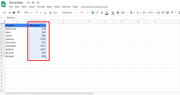
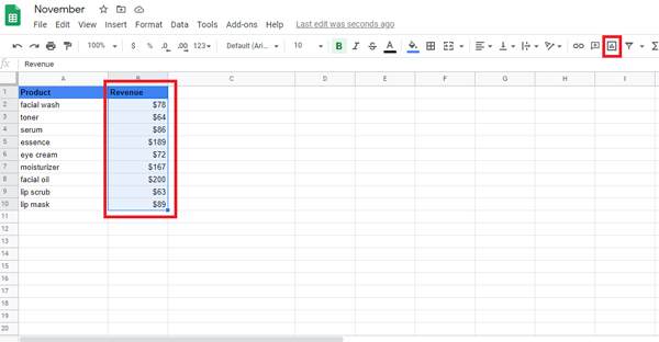
So, we’ll highlight cells C1 through C10. Then click the chart icon in the toolbar:
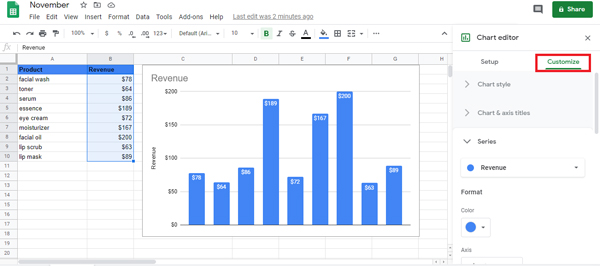
Google by default will display a pie chart. But the chart editor should present you with options. Let’s select ‘Column chart’ to make a bar graph.

And here is your bar graph:

How to Label a Bar Graph in Google Sheets
Now that you’ve made your first bar graph in Google Sheets, it’s time to customize the labels so the data you’re showing can be easily understood.
You can do this by clicking the 3 dots in the upper right of your bar graph and click ‘Edit chart.’

Using the same example chart, let’s put labels so we can identify which products are the highest revenue makers. Under ‘Series,’ click the three dots beside ‘Revenue’ then ‘Add Labels.’

Your chart now has labels!

If you want to change what your labels look like––type, font, size, color, etc.––select ‘Customize’ from the chart editor. You should find everything you need.
How to Change a Visualization in Google Sheets
We’ve mentioned this bit earlier, but if you want to change your graph visualization to something else, check on the right-hand side of your sheet to view your chart editor. You should see ‘Chart Type’ with a dropdown menu. If you click on it, you will be presented with a smattering of options

Here you’ll see all the options for viewing the data you’ve highlighted in your spreadsheet. Select the one you want and your data visualization will automatically change within your
spreadsheet.
How to Add Error Bars to Google Sheets
Error bars are used to visually illustrate the expected differences in your dataset.
In this case, let’s visualize the same data from the skincare shop. So, if you want to add error bars to Google Sheets, you’ll need to follow these 4 steps:
Highlight and insert the values that you would like to visualize

As mentioned, Google Sheets will automatically visualize the data as a pie map. To adjust this, press the drop-down chart form, and then pick the column.
Here’s what the chart should look like:

To add error bars to the above chart, still in the Chart Editor pane, switch to ‘Customize’ and select ‘Series.’

Select the ‘Error bars’ option:

Depending on the expected difference in value(s), you can opt to increase or decrease your number. We’re going to put 10 right now. Your percentage error bars should look like this:

Additionally, there are other types of error bars to pick from based on how uncertain the data is.

How to Make a Stacked Bar Graph in Google Sheets
In the example above, we had a simple dataset with just one series. But you can also deal with several series and create stacked bar charts on Google Sheets.
Suppose you have a dataset as seen below and use it to build a stacked bar chart:

Here are the steps in Google Sheets to create a stacked bar graph:
- Choose a data set (including the headers)
- In the toolbar, click the ‘Insert Chart’ icon.
- In the ‘Chart Editor’ (which will immediately appear on the right), click the Setup button, and change the chart type to the ‘Stacked bar chart.’ If Google Sheets inserts a ‘Stacked bar chart’ by default, you don’t need to do this move.

You can alter the title of the chart by double-clicking it. This helps you to type whatever title you like manually. The steps above will give you a stacked bar graph as seen below:

How to Make a 100% Stacked Bar Graph in Google Sheets
Like the standard stacked bar graph, you can also render a 100 percent stacked bar graph (where all the bars are equal in size and the value of each series in a bar is shown as the percent).
To insert a 100 percent stacked bar graph, follow all steps listed above to build a standard stacked bar graph but make the following changes:
- Select the stacked bar chart already inserted
- Click on the three dots in the upper right corner of the chart, and then click ‘Edit chart’.
- In the ‘Edit chart’ window, click ‘Setup’
- Choose ‘100%’ in the stacking options

The above steps will transform your standard chart to a 100 percent stacked bar chart (as shown below).

That’s how you create a bar graph in Google Sheets that’s easy to interpret.
You are the proud new owner of a wonderfully tidy and clutter-free bar chart that also expresses the data story easily, simply, and precisely.
Anyone can learn how to make a bar graph on Google Sheets. In just a few easy steps, you’re going to make bar graphs that articulate your data story in a convincing way that encourages action.