
Without a doubt, line graphs make a very important chart out there that can easily signify data trends over a period of time. So if you need to track something, let’s say, the sales your business makes on a yearly basis or the average number of people that comes in and out of your store, line graphs are the way to go.
And with Google Sheets, making line graphs has become as easy as pie, even those without prior knowledge can do it. We will show you in this guide how to get started making a line graph on Google Sheets.
Let’s jump right in.
How to Make a Line Graph in Google Sheets
Below are the steps to make a line chart in Google Sheets
Open Google Sheets and enter the data that you want to show on a line chart. The data can be anything. The example below is a comparison of sales between two sample companies.

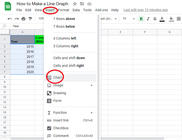
Once you’ve entered your data, simply select everything, and then go to your top menu, click on Insert, and then Chart.

The Chart Editor dialog box should be shown. Now click the Chart Type tab and then click the Line Chart tab. You should now see a set of different Line charts included in your array. For now, we’re going to pick the most popular graph that will be the first one on the list.
Note: Google Sheets is intelligent enough to have already selected the Line Chart for you based on your data type and range. You can see in the screenshot below the Google Sheet did it for me automatically.

And that’s the basics of it! But if you want to customize it up a bit, Google has some built-in functions in its Chart editor to make your work more detailed.

From font style to font size, and from orientation to color, the customization tab really helps you to make the chart your own.
Chart Style
This segment gives you the ability to adjust the background color of the chart as well as the border color and font of the chart. You should determine if you want the map to have smooth lines, maximized vision, plotted null values, or a contrast mode layout.
Chart & Axis Titles
Each chart has a title so that the viewer knows what details they’re looking at. The title portion of the map and axis allows you not only to assign a title to your chart and each axis, but also to adjust the font type, font size, shape, orientation, and color.
Series
You can customize the design of your lines here. By changing the thickness of each line, the scale of the point marker, and the outline of the point marker, you will construct a chart that displays the details you want to express more clearly. In this section, the aggregate drop-down menu helps you to pick the sort of aggregate you want your chart to view. You can also configure a particular marker on your map under “format data point” then “add.” You may also opt to view features such as error bars, data marks, and trend lines.
Legend
This menu helps you to put the legend in the place you like as well as change the font, scale, shape, and text color of the legend.
Horizontal Axis
Like the above customization choices, the horizontal axis menu allows you the ability to change the font of the label, the font size of the label, the label format, and the text color. Two boxes under this section also allow you to change the chart by making text labels and reversing the order of the axis.
Vertical Axis
Once again with a variety of text, font size, format, and color, this menu option has two blank boxes for entering the minimum and maximum values for the Y-Axis. You should check the “Treat labels as text” box as well as adjust the scale factor to include punctuation in your values. If you like, you can customize the vertical axis by checking the “log scale” box and by choosing
the preferred design from the corresponding drop-down menu.
Gridlines
Gridlines can be helpful when viewing results. They have a viewpoint that lets the listener better appreciate and interpret the data presented. By choosing the major and minor grid-line number, as well as the major and minor grid-line colors, the charts would surely come to life as do the data they display.
Important Parts of a Line Graph
The important parts of a line graph include:
- Y-Axis (vertical axis)
- X-Axis (horizontal axis)
- Chart Title
- Markers
- Grid
- Y-Axis Label
- X-Axis Label
- Legend
Purpose of Line Graphs
The line graph is a graph that indicates the relationship between two or more quantity changes over time. However, a line graph may also represent only one quantity shift if there is nothing to compare with it.
The easiest way to use a line graph is anytime you need to illustrate trends, shifts, rises, decreases, etc. The line graph is more intuitive to demonstrate changing and emerging patterns than any other form of graph.